©2024 - Sahala Brownies Brand Identity

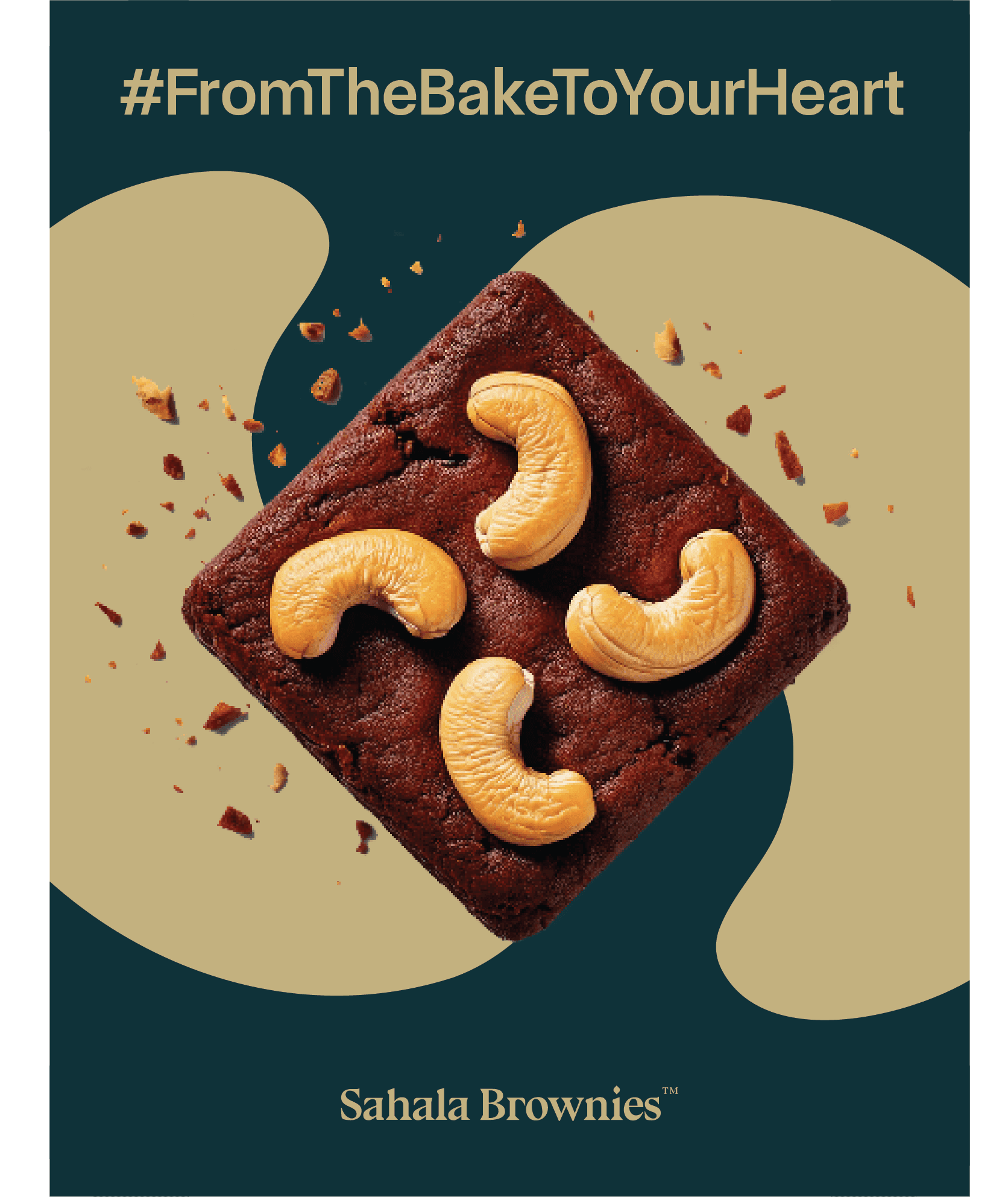
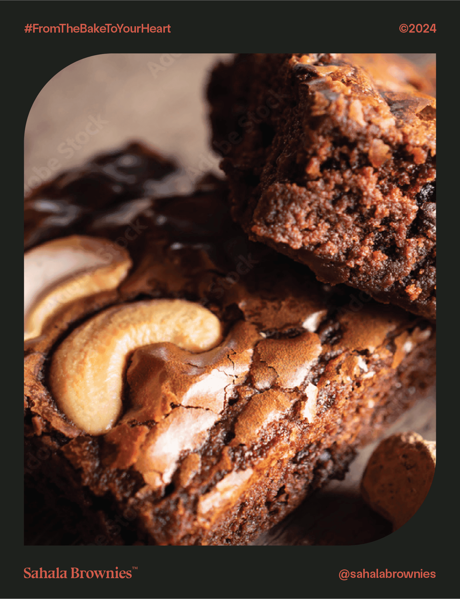
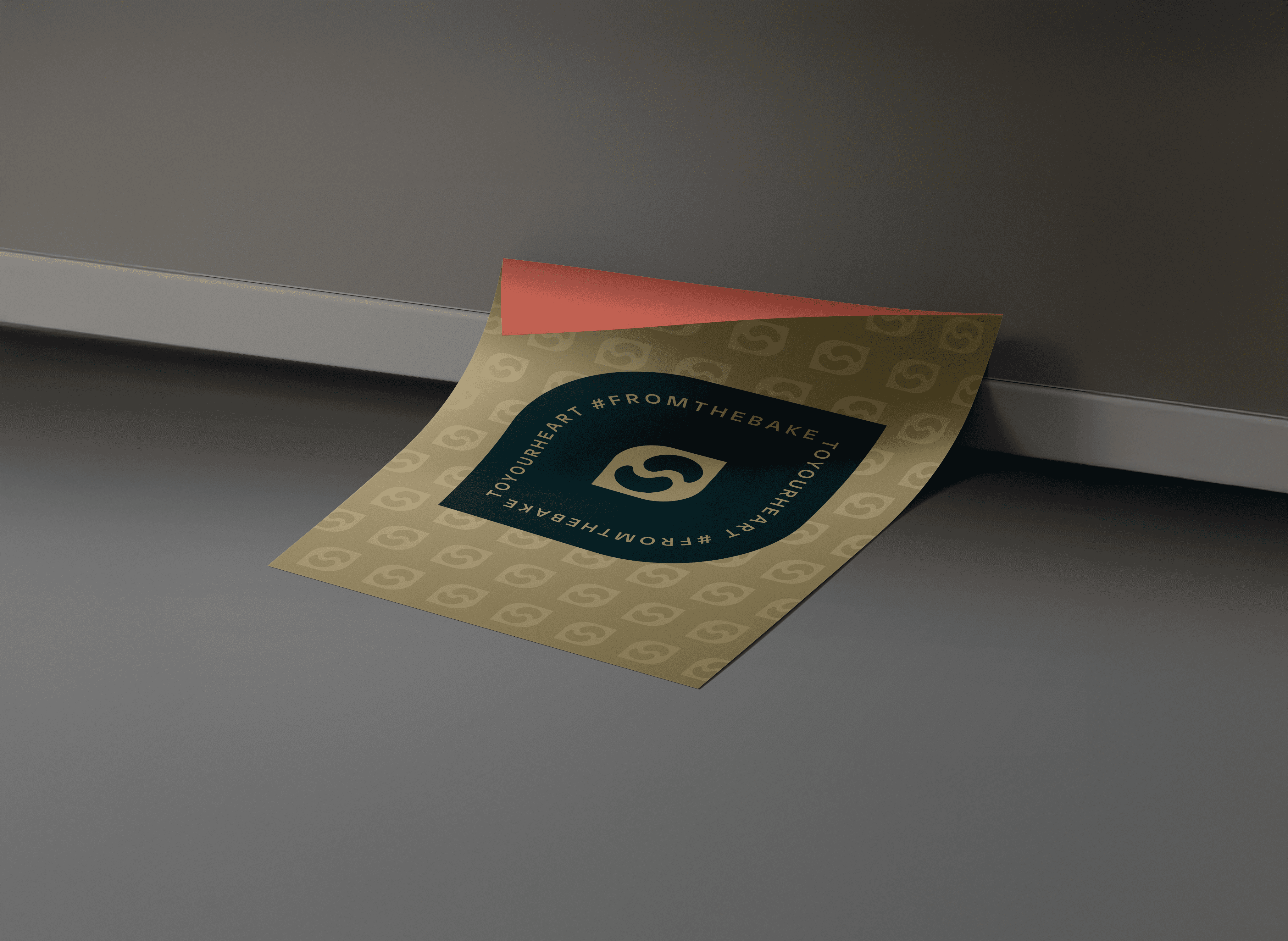
#FromTheBakeToYourHeart
The brand emerges from a cherished family tradition of baking, brought forth into the modern age with a twist of innovation and dedication to quality. The brand aims to resonate emotionally with consumers by evoking the nostalgia and comfort of homemade treats. The objective is to establish Sahala Brownies not just as a premium brand, but as a heartfelt experience that transforms simple gatherings into memorable celebrations. By weaving the essence of home-baked goodness with professional craft, Sahala Brownies aspires to become synonymous with warmth, comfort, and the unparalleled joy of sharing.

Sahala Brownies™
OVERVIEW
PROJECT TYPE
SUBJECT
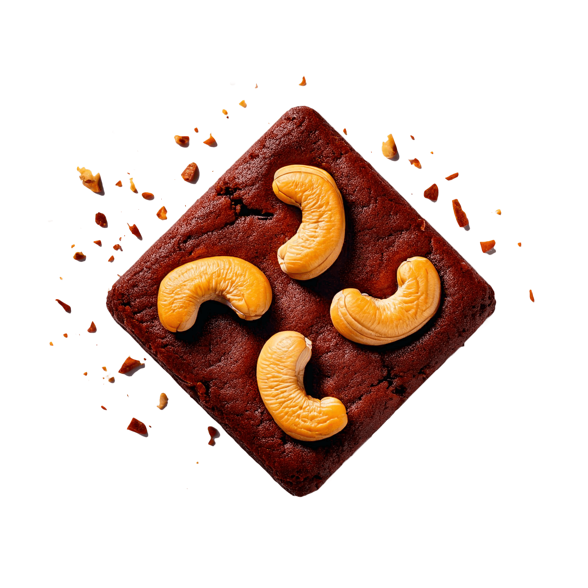
Sahala Brownies™ is a premium Indonesian brand specializing in artisanal brownies, cookies, and cakes. Known for its rich, indulgent flavors and high-quality ingredients, Sahala Brownies combines traditional recipes with innovative twists to create memorable treats for all occasions. From classic brownies to creative cookie varieties, every item is crafted with a dedication to excellence and taste, making Sahala Brownies a go-to choice for dessert enthusiasts who appreciate both quality and creativity.
2024
BRAND IDENTITY
YEAR
Independent Project
Poster Design


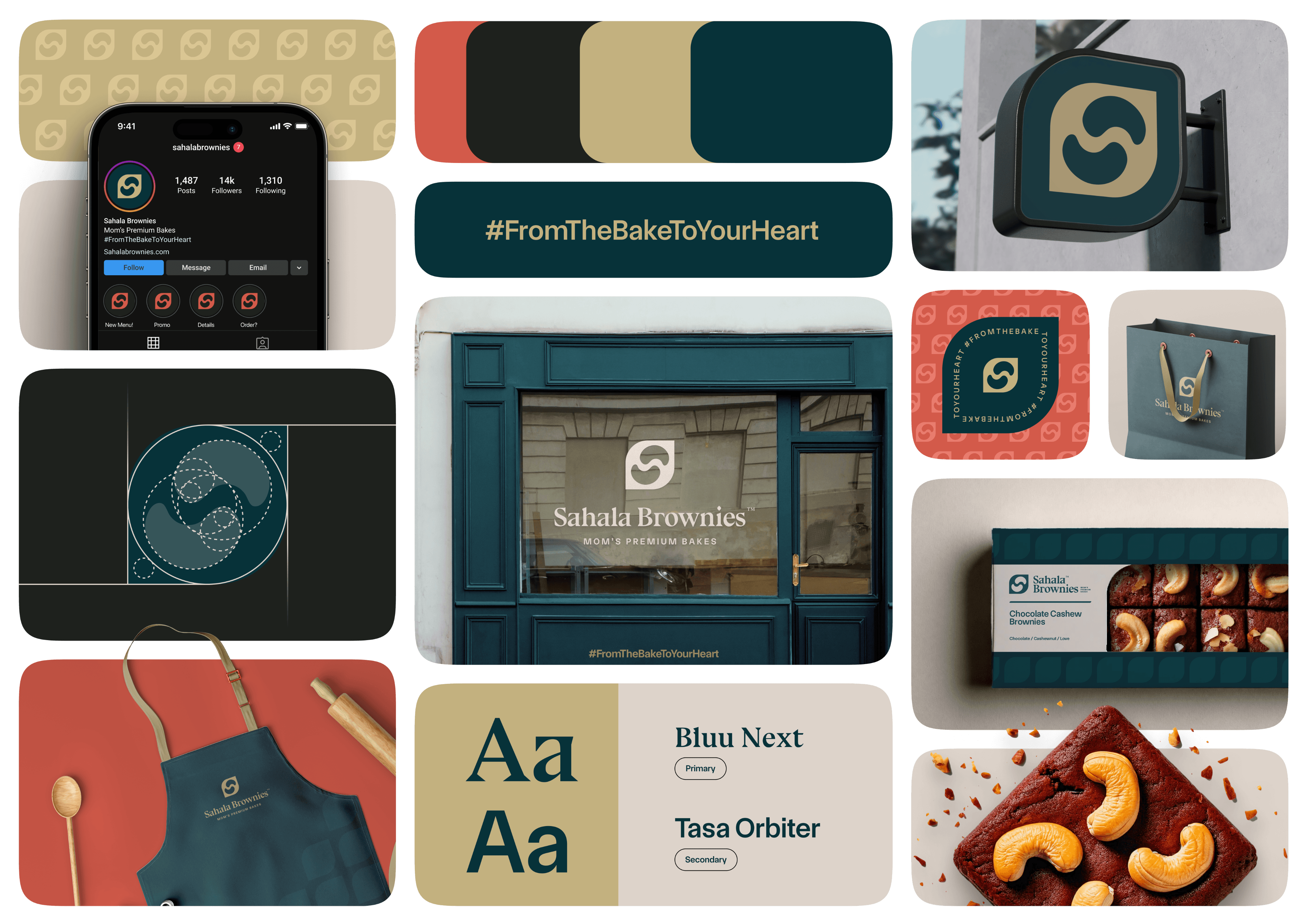
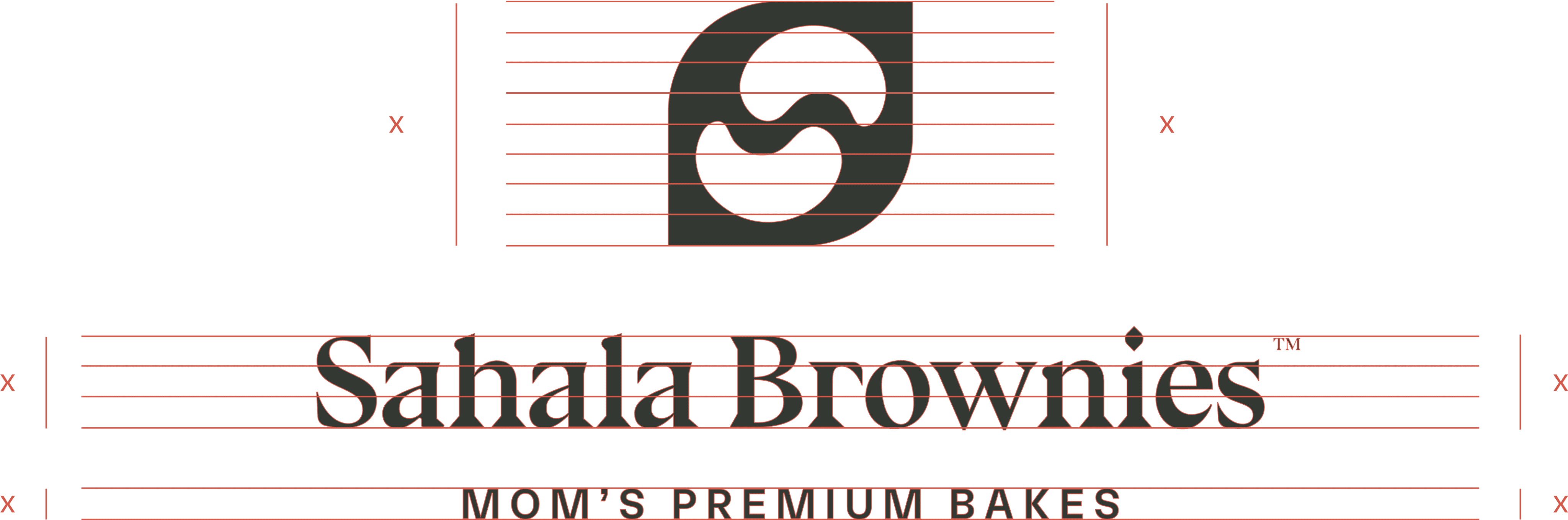
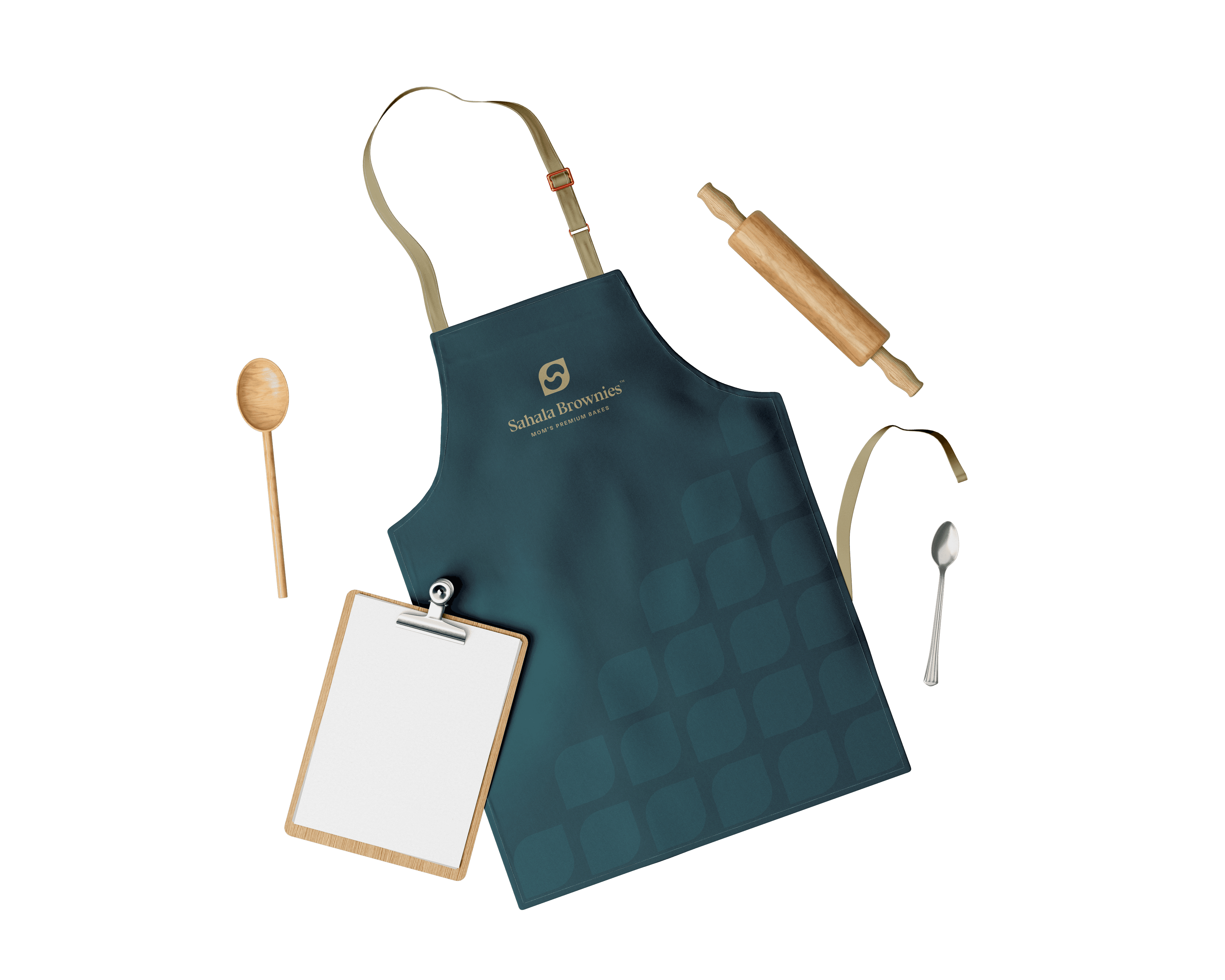
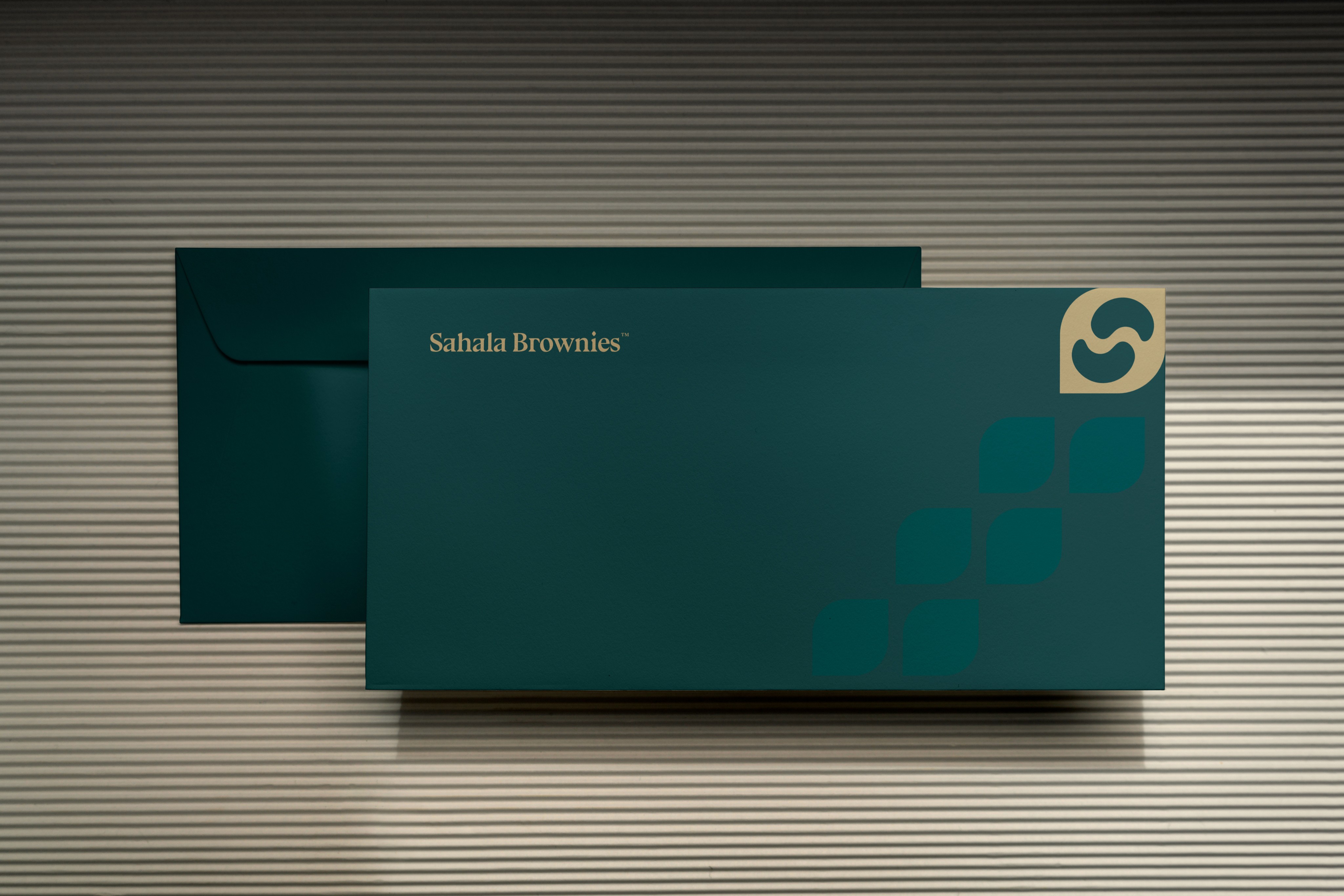
Sahala Brownies™ logo incorporates a stylized ‘S’ within a shield-like emblem, signifying both protection and tradition, reflecting the brand’s commitment to quality and trust. This emblem is inspired by the nurturing warmth of a mother’s kitchen, where every batch of brownies is made with meticulous care and love. The choice of a deep, rich green palette echoes the freshness and natural ingredients used, while the golden accents signify the premium quality of the desserts. The serif font used for “Sahala Brownies” conveys sophistication and timelessness, with “Mom’s Premium Bakes” in a slightly playful script that adds a personal, approachable touch. The rounded corners of the emblem, mimicking the soft edges of freshly baked brownies, enhance the logo’s friendly and welcoming feel.
Bluu Next
Bluu Next BoldⓇ is a free serif font that's all bite, no bark. This sharp-edged typeface kicks boring serifs to the curb. It's precision-cut for impact, turning ho-hum text into eye-catching statements.
Designed By
Jean-Baptiste Morizot
Available Style
2 Styles
Category
Serif

02

01

03

04

05
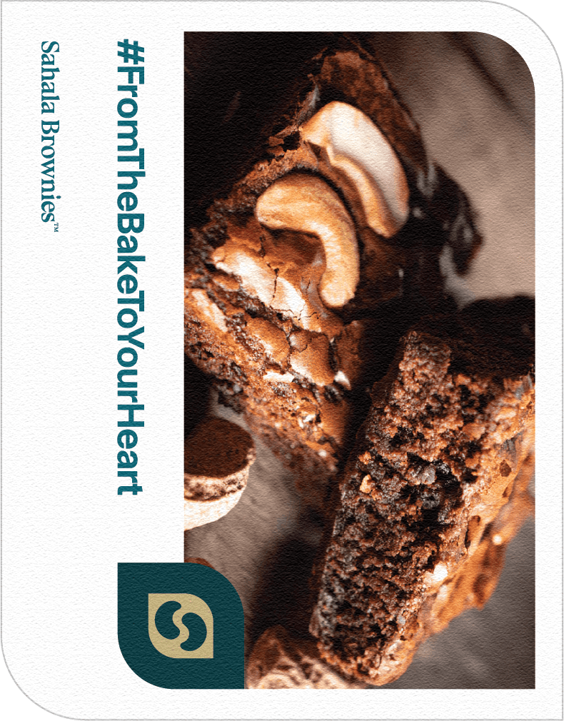
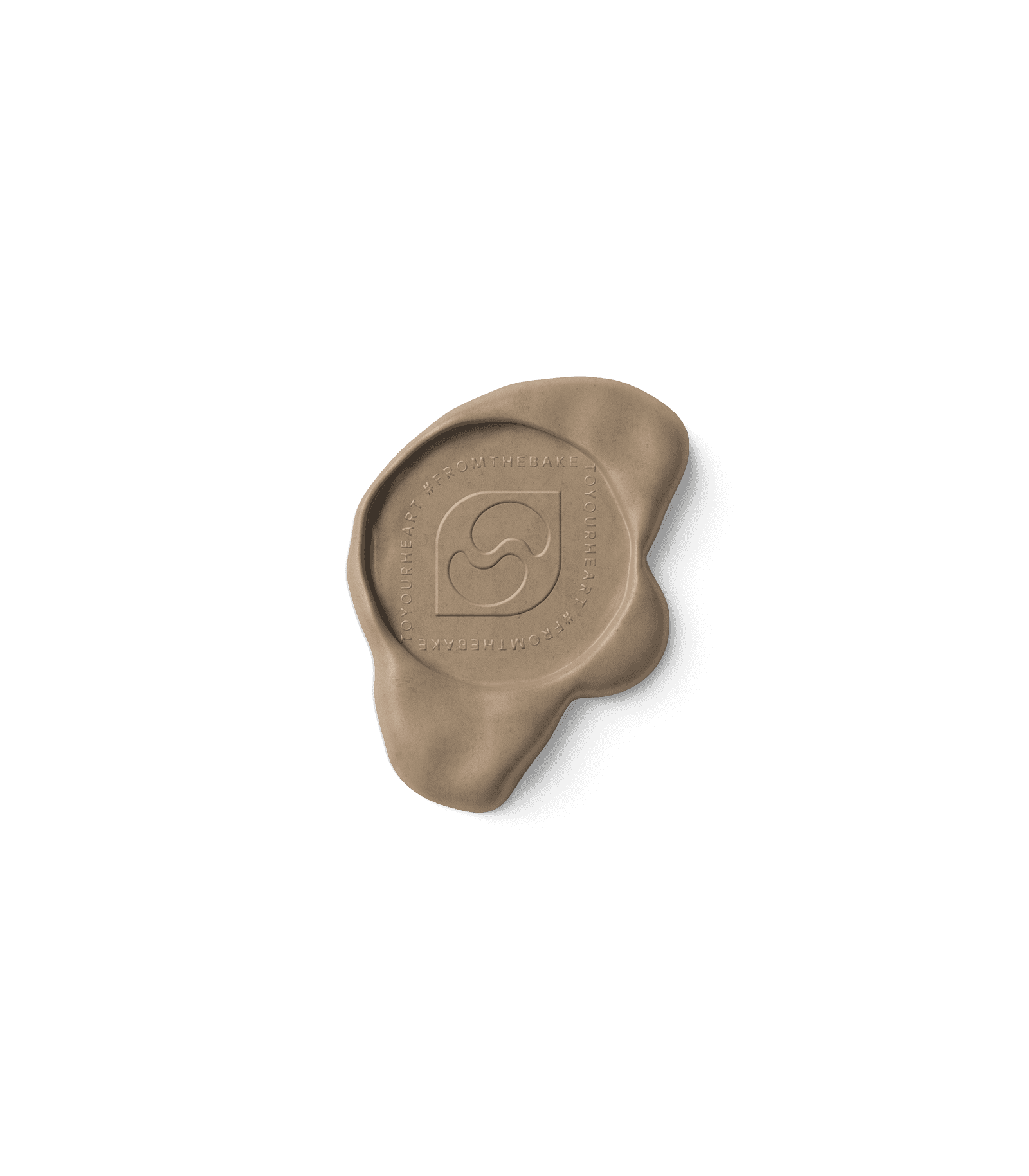
The story behind the slogan is rooted in a tradition passed down by the founder’s grandmother, who would always say, “A good bake should never just fill the belly, but should warm the heart.” This sentiment is woven into every batch, ensuring that each product is more than just a dessert it’s a piece of heartfelt connection, a moment of warmth delivered straight to your soul.



#FromTheBakeToYourHeart